Visual charts in historical reports
To consume data faster and better and to get a quick overview of the trends for a specific report, we are introducing visual charts to represent data in historical reports. Customize the historical reports to enable visual charts. Take a quick look at the data charts and quickly gather the key performance indicators. You do not need to dig through the numbers any more!
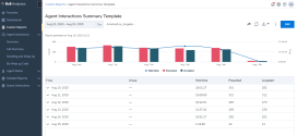
Let’s say you wish to review the key metrics for your Tier 1 Support agent group, customize the agent interactions report to view the key data in the visual chart.
To set up a visual chart to appear on your historical report:
- Go to the custom report or template report that you want to customize.
- Select the date range, dimensions & metrics for your report.
- Enable Show charts.
- Click Configure and select the metrics that you want to be included in the graph.
- By default, the metrics are grouped by type for easier configuration of the chart type.
- The metrics selected in the previous configuration window appear in this list. You cannot have different metrics in the report and in the chart.
- Click Done to save the custom report. The chart now appears at the top of your report.

Let’s say you wish to review and compare the performance of your tier 1 and tier 2 support groups, simply set the filter to the desired groups and set the granularity to None.

Note: The charts cannot be exported or included in the scheduled reports currently.
Note: If you disable subtotal data, the visual charts will be disabled as well.