Create a dashboard using widgets
To create a dashboard, you must use one or more of the available widget types. The widgets allow you to select metrics relevant to queues, agent status, agent performance, and agent resources. This way, you can view the information that you need to know in order to ensure a high level of service quality.
Widget types
8x8 Analytics for Contact Center offers two types of widgets for the dashboards:
- Historical widgets: Allow you to create visual data charts with historical information. Access the historical data about queue activity or agent activity for yesterday, last 7 days, last 30 days or more. Whether you are tracking weekly activity of queues or performance of agents, customize your dashboard with historical widgets.
- Real-time widgets: Allow you to access the key performance indicators for queues and agents in real time or in short time intervals. Whether you are tracking the number of agents available to take calls in real-time or the average waiting time in the last 30 mins, get the data in real time using these real-time widgets.
Features
- Customize your dashboard by creating widgets tailored to your business needs.
- View queue-level and agent-level metrics on demand.
- Access a summary of your queue activity, including how many interactions a queue has accepted, rejected, finished, and more.
- View agent performance within a queue, including information on the total and average metrics of the agent's communications.
- Keep track of the status of all agents within a queue, and see how many agents are available, on break, working offline, and more.
- Monitor real-time information on agents, including their status and information on their current call.
- Select intra-day time interval to access key metrics for selected time range
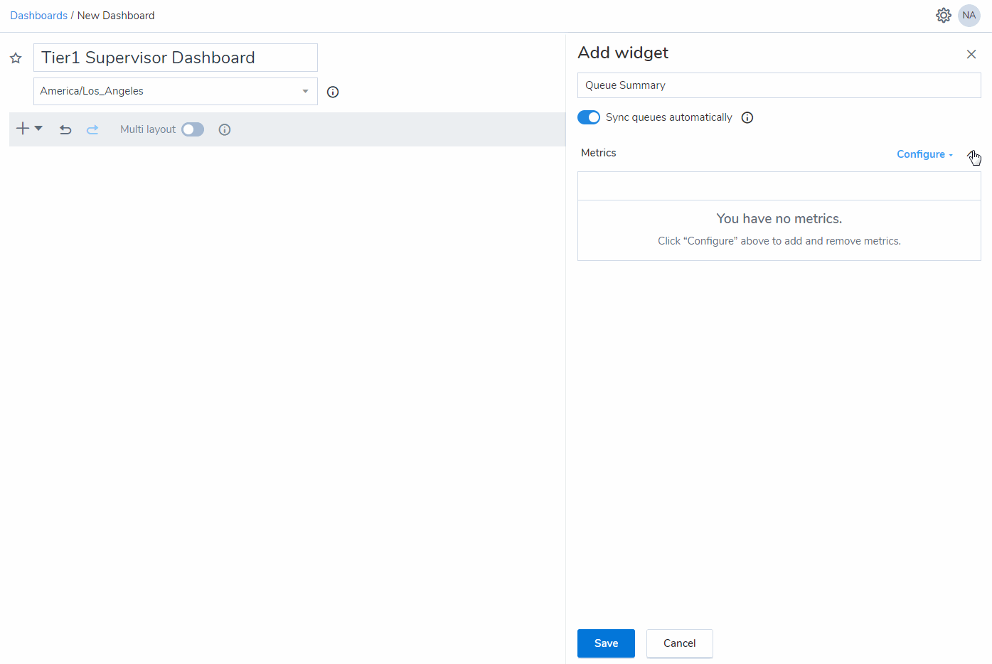
To create a dashboard using widgets:
- After you log in, click Dashboards from the navigation menu.
- In the top right hand corner, click New to begin creating a new dashboard.
- Enter a name for the dashboard.
- Select a time zone.
Note: The time zone selected for the dashboard affects the data being presented on the configured widgets.
- Click
 to add a widget from the historical or the real-time widget groups.
 - Based on the selected widget, enter and select the required information. You can add as many widgets as needed to the dashboard.
-
After adding the widgets, save the dashboard.


Add a real-time widget
8x8 Analytics for Contact Center offers the following real-time widgets:
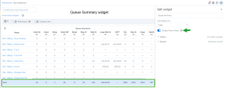
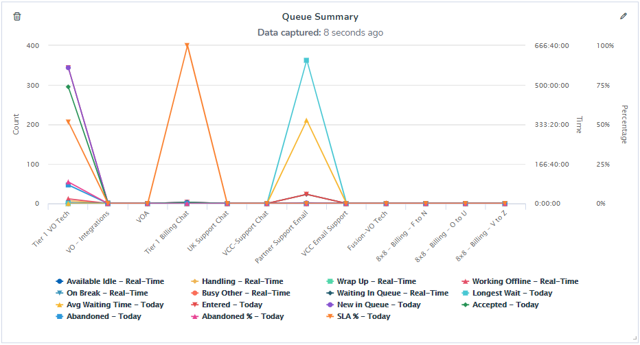
With the queue summary widget, you can get a bird's-eye view of your queue on demand. The metrics in this widget include the number of interactions accepted, abandoned, and entered by agents in the queue, the average waiting time for the queue, and much more! This way, you can immediately see if the queue is meeting its service requirements, and find ways to increase the effectiveness of your queue. You can also view cumulative metrics for queues such as the number of agents available, number of agents currently handling interactions, working offline, on break, number of interactions which have entered queues, accepted, abandoned and more.
Features
Access a summary of your queue activity, including how many interactions a queue has accepted, rejected, finished, and more.
To create a queue summary widget:
- Click , and select to add a Queue Summary widget from the drop-down menu.
- In the widget that opens on the right, enter the name of the widget.
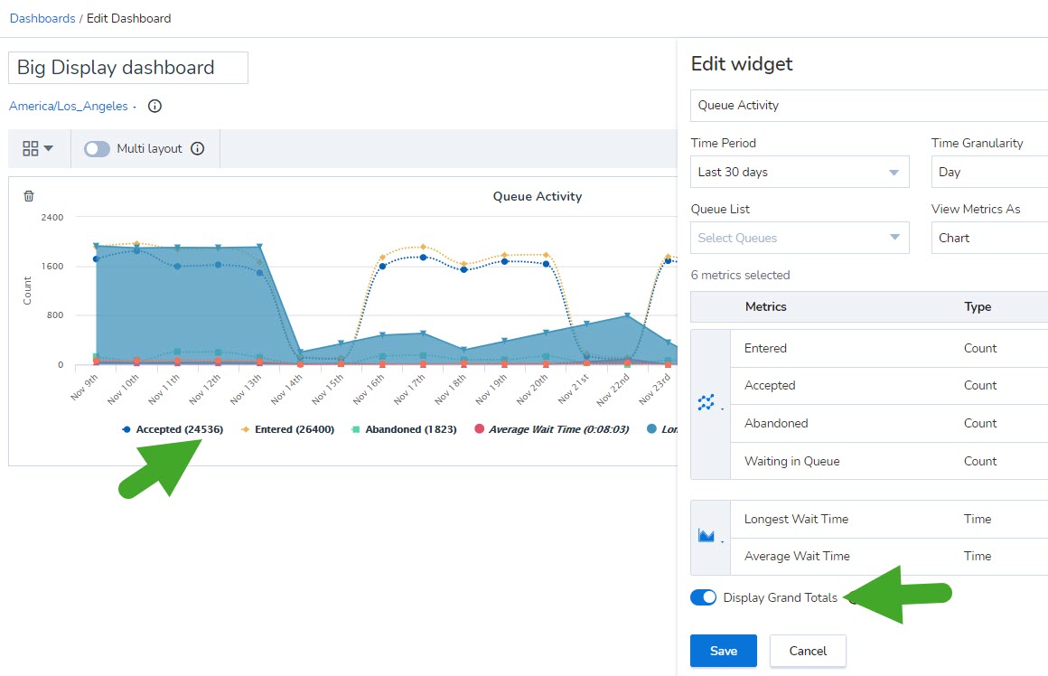
- Under View Metrics As, select to view the data in tabular or graphical format. The chart refreshes every five seconds.
- Enable the toggle for Display Grand Totals. You can now view cumulative metrics for queues such as the number of agents available, number of agents currently handling interactions, working offline, on break, number of interactions which have entered queues, accepted, abandoned and more.
- To select the desired metrics, click
 next to Metrics, and then click Configure to select from the available list of metrics, or search to find and add specific metrics.
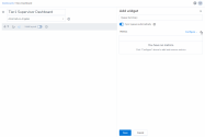
Note: Metrics are categorized into time Interval metrics, Real Time metrics, and metrics for Today.
- Select the queues you supervise. Click next to Queues, and click Configure to select from the drop-down list of queues, or search the list to add specific queues quickly (John selects Tiers 1, 2, and 3).
- Click Save to save the queue summary widget.

Interval data is collected at 15-minute and 30-minute intervals.

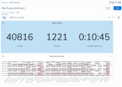
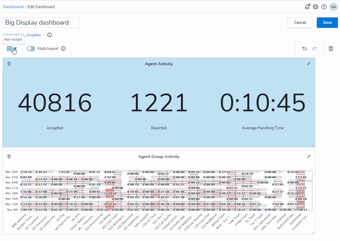
You can configure the Queue Summary real-time widget to display up to 3 metrics as a Big Number. This is ideal when displaying queue-related information on a large screen. It makes it easier for both agents and supervisors to view these real-time metrics.
To configure the queue summary widget to display metrics as a Big Number:
- From the menu, go to Dashboards.
- Click New to create a new widget.
- Click
 and select Queue Summary from the drop-down menu.
 - The Add widget window appears. Specify a name for the widget.
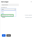
- From the View Metrics As drop-down list, select Big Number (up to 3 metrics).
- After selecting your desired metrics, click Save.

Information relevant to your selected metrics is displayed as large numbers.
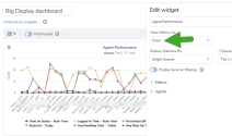
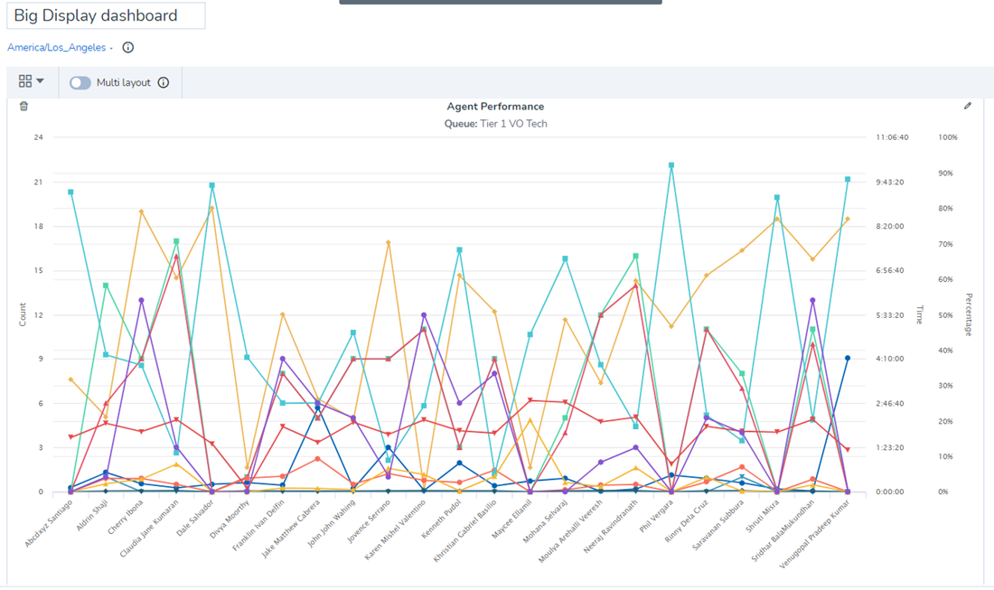
To add an agent performance widget, you must select a queue, select the agent performance metrics, such as the number of calls, accepted, rejected, handled, average handling time, and more for every selected agent. These metrics reflect data for the last 15 mins, 30 mins, or for the day so far. You can also access real-time metrics about the current status of the agent, the status on lines 1 and 2, and the duration of the login. You can view cumulative metrics such as the total duration agents have spent logged in, total number of interactions offered, accepted, rejected, and more.
Features
View agent performance within a queue, including information on the total and average metrics of the agent's communications.
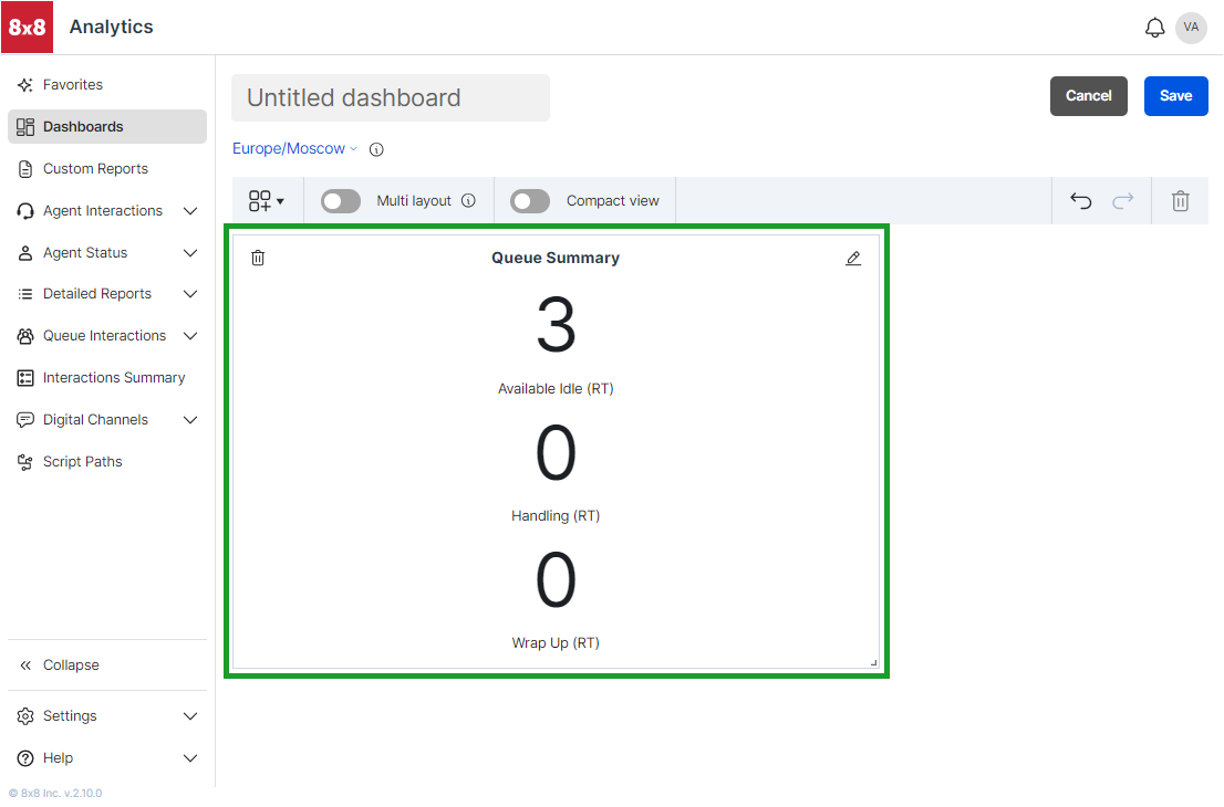
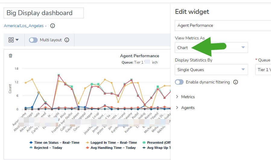
To create an agent performance widget:
- Click , and select to add a Agent Performance widget from the drop-down menu.
- In the widget that opens on the right, enter the name of the widget.
- Select a queue from the drop-down list (John selects Tier 1).
-
Under View Metrics as, select to view the data in tabular or graphical format. The chart refreshes every five seconds.
- Enable dynamic filtering. Dynamic filtering reflects metrics for any selected queue in the Queue Summary within the dashboard. If dynamic filtering is not selected, it shows the agent performance metrics for the selected queue only.
For example, John must always keep track of the agent performance of all three queues. So, he chooses the Dynamic data type. It allows him to view the agent performance metrics of any of the three queues by simply selecting the desired queue in the Queue Summary widget. - The option to Sync agents automatically is enabled by default, and selects all agents supervised by you. Disable this setting to manually select the desired agents from the list, or filter by keywords.
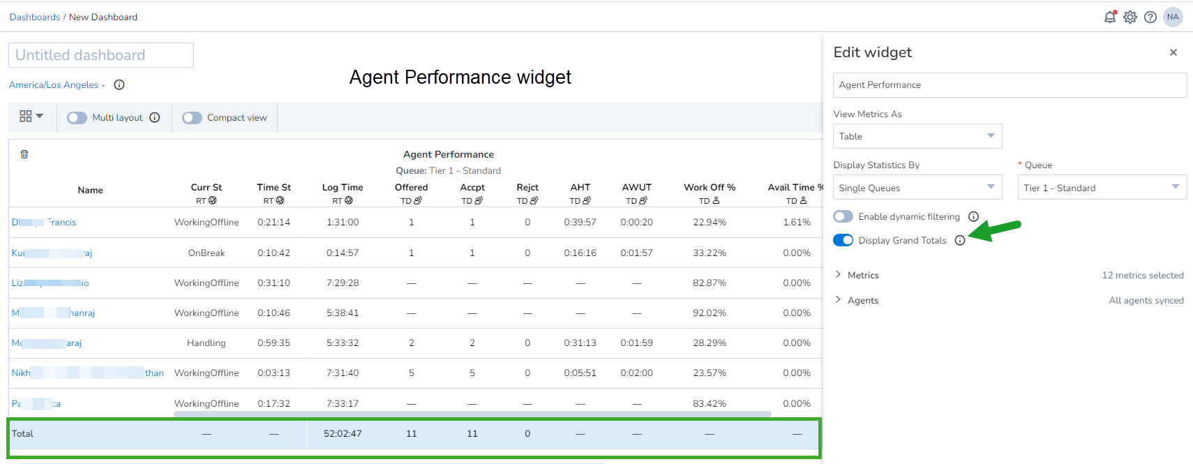
- Enable the toggle for Display Grand Totals. You can now view cumulative metrics such as the total duration agents have spent logged in, total number of interactions offered, accepted, rejected, and more. The data table appears on the left side of the panel.
- To select the desired metrics, click next to Metrics and then click Configure to select from the available list of metrics, or search to find and add specific metrics.
Note: Metrics are categorized into time Interval metrics, Real Time metrics, and metrics for Today.
- Select the agents you need the data for. Click next to Agents, and then click Configure to select from the drop-down list of queues or search the list to add specific queues quickly (John selects Tiers 1, 2, and 3).
- Click Save to save the Agent Performance widget.
- Resize the data table or chart for better viewing.

You can configure the Agent Performance real-time widget to display up to 3 metrics as a Big Number. This is ideal when displaying agent-related information on a large screen. It makes it easier for both agents and supervisors to view these real-time metrics.
To configure the agent performance widget to display metrics as a Big Number:
- From the menu, go to Dashboards.
- Click New to create a new widget.
- Click and select Agent Performance from the drop-down menu.
- The Add widget window appears. Specify a name for the widget.
- From the View Metrics As drop-down list, select Big Number (up to 3 metrics).
- From the Queue drop-down list, select a queue.
- From the View Metrics As drop-down list, select Big Number (up to 3 metrics).
- After making your selections, click Save.

Information relevant to your selected metrics is displayed as large numbers.
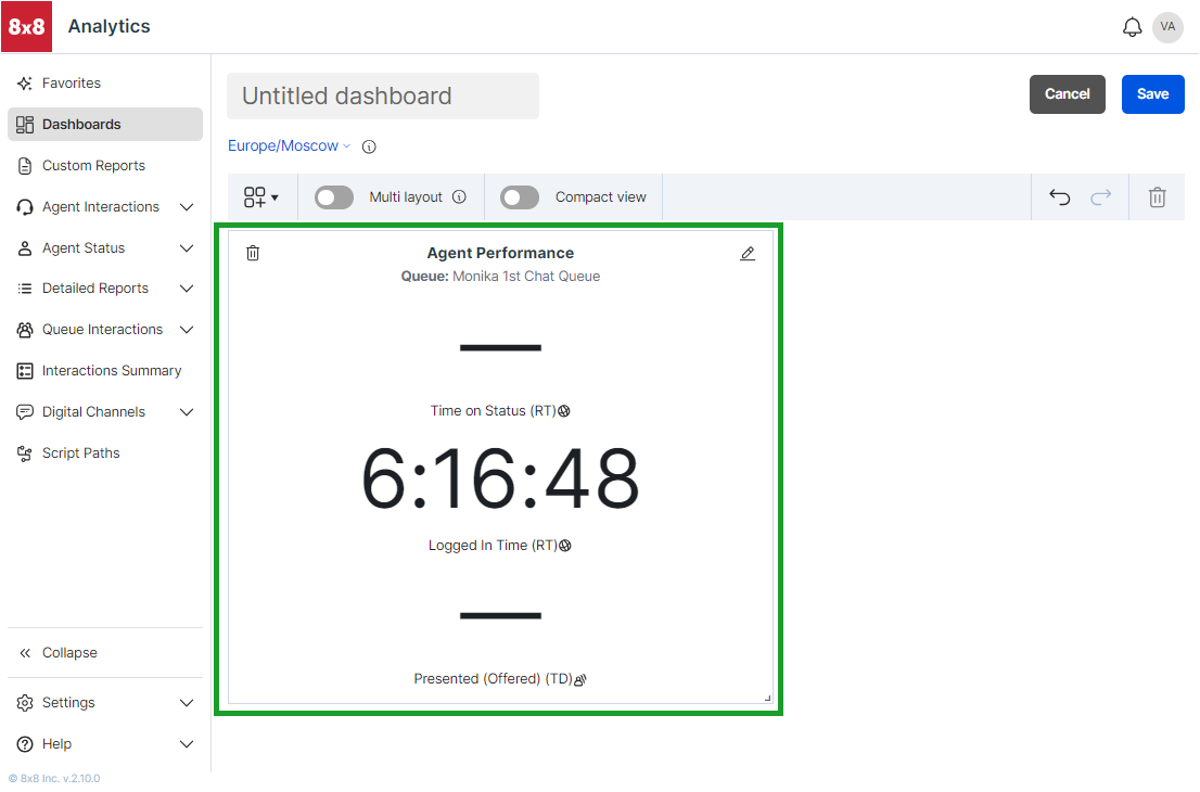
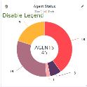
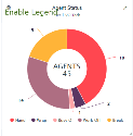
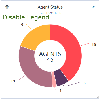
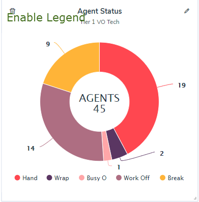
The agent status widget allows you to check the number of agents in each status for a specific queue. How many agents are available, working offline, or busy handling interactions in this queue or another queue, or on break? The pie chart shows the status data in real time.
Features
Keep track of the status of all agents within a queue, and see how many agents are available, on break, working offline, and more.
To create an agent status widget:
- Click , and select to add a Agent Status widget from the drop-down menu.
- In the widget that opens on the right, enter the name of the widget.
- Select a queue from the drop-down list (John selects Tier 1).
- Enable dynamic filtering. Dynamic filtering reflects metrics for any selected queue in the Queue Summary within the dashboard. If dynamic filtering is not selected, it shows the agent performance metrics only for the selected queue. For example, John must ensure agents availability in the Tier 1 queue, which handles interactions from their premium customers. To keep an eye on the data at all times, John chooses the Static type.
- Slide the toggle Enable legend to show/hide the information indicators in the pie chart.
- Click Save to save the agent status widget.
The data pie chart appears on the left side of the panel. - Resize the pie chart for better viewing.
John creates a second agent status widget and chooses the Tier 2 queue, but selects dynamic data type. This widget helps him watch the status of agents in Tiers 2 and 3 by simply selecting the desired queue in the Queue Summary widget.

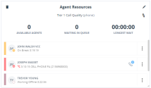
The agent resources widget simply lets you access real-time data about an agent’s status. Is Emily in Tier 1 on a call, or available to take a call? If she is on a call, how long has she been on the call? who is she on the call with? This widget answers all these questions in real time. The status of each agent in the selected queue is indicated by the color used in the agent status pie chart.
Features
Monitor real-time information on agents, including their status and information on their current call.
To create an agent resources widget:
- Click , and select to add an Agent Resources widget from the drop-down menu.
- In the widget that opens on the right, enter the name of the widget.
- Select a queue from the drop-down list (John selects Tier 1).
- Enable dynamic filtering. Dynamic filtering reflects metrics for any selected queue in the Queue Summary within the dashboard. If dynamic filtering is not selected, it shows the agent performance metrics only for the selected queue.
For example, John must ensure that agents use their time efficiently. He watches how long an agent is on break, checks if he has exceeded the allowed break time, and pings an agent to make themselves available soon if the count of available agents goes too low. - Click Save to save the Agent Resources widget.
John has now completed creating all the necessary widgets. The next step is to create thresholds that will keep a check on critical metrics.

As a contact center manager who monitors agent performance or the call handling capability of a queue, you want to closely monitor certain key performance indicators (KPI) to ensure customer satisfaction. Whether it is the call waiting time in a queue, or the longest hold by an agent, you want to access these KPIs quickly without having to hunt for them on your data-rich dashboard. With the new single metric widget for agents or queues, you can now select an important metric and create a widget to display these critical KPIs prominently as desired. This improves the visibility of the most important metrics. Watch whether the average handling time of an agent call exceeds five minutes, or if the longest waiting time for a queue exceeds a certain time limit. These widgets draw immediate attention to the KPIs on the dashboard. Get to the numbers quickly, and take corrective actions.
Features
- Get improved visibility of critical KPIs on the data-rich dashboard using single stat widgets.
- Create a single metric widget for any queue or agent performance metric.
You can create a single metric widget for queues or agents:
- For queues: Select from any of the available queue performance metrics, and create a single stat queue widget.
- For agents: Select from any of the available agent performance metrics, and create a single stat widget.
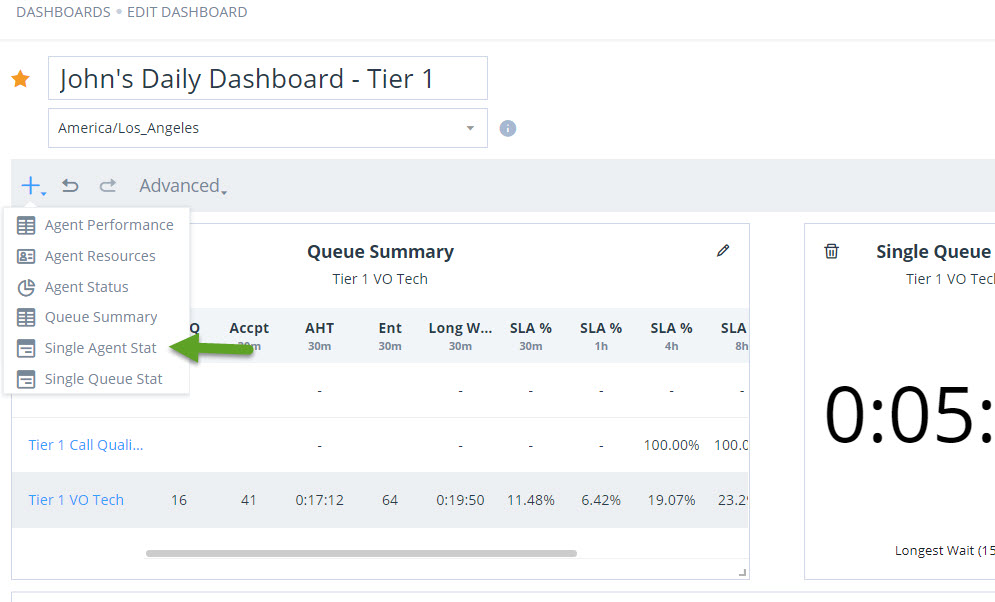
To create a single stat widget for queue or agent performance metrics:
- Go to Dashboards, and select an existing dashboard.
- In the edit mode, click , and select Single Queue Stat or Single Agent Stat to add a new single stat widget from the menu.
- In the Add Widget box, add a name, and select the desired queue and a metric.
- Enable the dynamic filtering toggle to apply the metric dynamically for a desired queue or agent.
- Click Save to save the widget.
- Position the newly created widget on your dashboard as desired, and save your dashboard.


Apply Thresholds to a Single Stat Widget
A threshold allows you to define a limit for a metric, which alerts supervisors when exceeded, seeking their attention. Threshold alerts can warn you to watch metrics closely and necessitate action. You can create and apply thresholds to queues, and get visual and audio alerts when the thresholds are met. If you create a threshold for longest wait time in a queue, assign it to a queue, and create a single stat widget for this metric, you can watch the threshold visual alerts on the single stat metric. Learn how to create and assign thresholds and get instant alerts when the metrics slip.
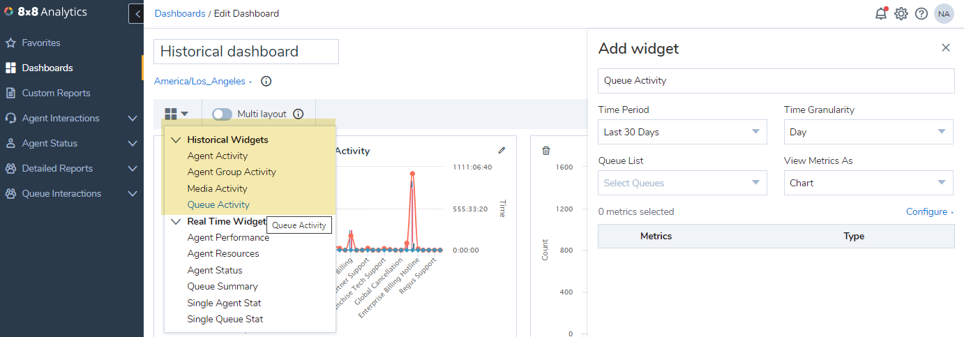
Add a historical widget
8x8 Analytics for Contact Center offers four historical widgets:
As a supervisor, let’s say you want to understand how the number of interactions entered are linked to the handling time in a queue. Has there been a spike in the number of interactions and the waiting time on any day this past week?
- Log into 8x8 Analytics for Contact Center.
- Go to Dashboards. Select an existing dashboard or create a new dashboard.
-
Click
and select Queue Activity widget from the list of historical widgets in the drop-down menu.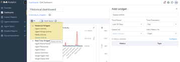
- Enter a name for the widget.
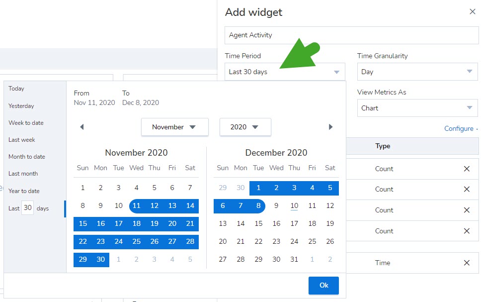
- Select to get data from a given Time Period such as past 7 days, yesterday, last 30 days, and more or select a custom date range.
- Select Time Granularity to aggregate data from the available choices. Let's say you choose to get data for Last 30 days, you can set to aggregate the data daily or weekly.
- Select all queues or individual queues to gather data from.
-
Under View Metrics As, select to view the data in one of the following formats:
- Chart: Displays data in a graphical format. You can further select the specific graphical format such as bar graph
 , line graph
  , dotted line chart
  , and area chart
  .
. - Table: Displays data in rows and columns in a tabular format.
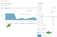
- Big Number: Displays up to three key metrics in big and bold format. big and bold font. You can also highlight your metrics with a background color. Learn more.
- Heat Map: Displays data as a heat map. A heat map uses a system of color coding to represent values. It is useful when you have large data and you need to detect the outliers quickly. Learn more.
- Chart: Displays data in a graphical format. You can further select the specific graphical format such as bar graph
- Select all metrics or individual metrics such as Entered; Accepted, Abandoned, Processing time; Waiting time.
- Additionally, you can view the grand totals of the key metrics on the legend. While editing a widget, simply enable the option to Display Grand Totals.
- Click Save to view the data in the selected format.
When you run the widget, you can see the data chart indicating the key metrics. You can see if the average handling time spiked with the number of interactions? Was there any correlation? Did the processing time increase? By just looking at the chart, you can now see the trends.
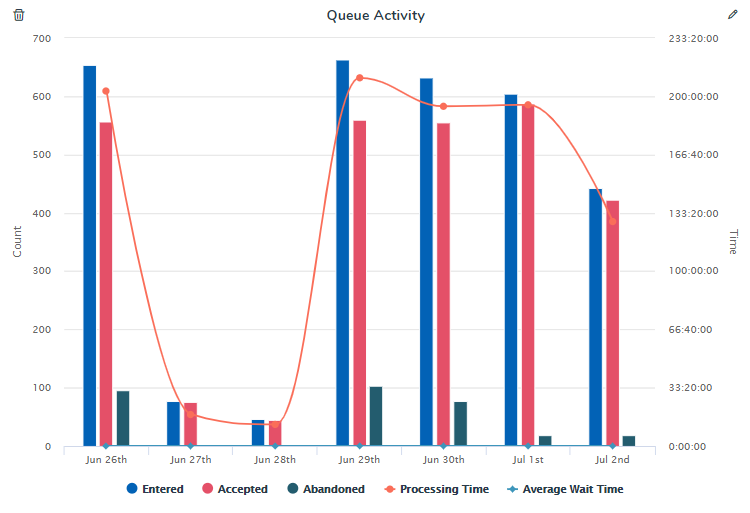
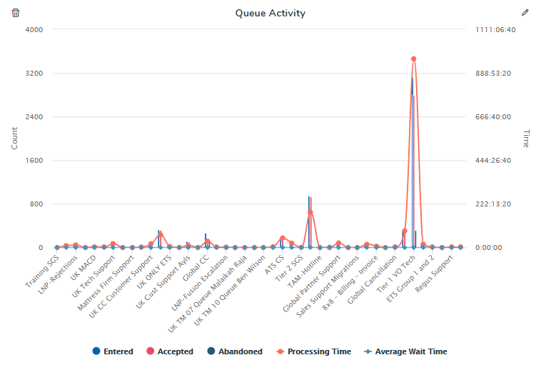
If you wish to simply track the queues with the highest wait times, set the time granularity to ‘None’ and run the report. You can now see the processing time and waiting time by queue. See which queues had a higher than average handling time? This helps in investigating further.
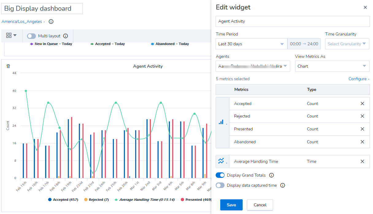
Let’s say you want to track the performance of an individual agent, compare their performance with other agents serving the same queue or the same group.
- Click and select Agent Activity widget from the list of historical widgets in the drop-down list.
- Select to get data from a given Time Period such as past 7 days, yesterday, last 30 days, and more or select a custom date range.
- Select Time Granularity to aggregate data from the available choices. Let's say you choose to get data for Last 30 days, you can set to aggregate the data daily or weekly.
- Select all agents by default or select specific agents.
-
Under View Metrics As, select to view the data in one of the following formats:
- Chart: Displays data in a graphical format. You can further select the specific graphical format such as bar graph , line graph , dotted line chart , and area chart .
- Table: Displays data in rows and columns in a tabular format.
- Big Number: Displays up to three key metrics in big and bold format. big and bold font. You can also highlight your metrics with a background color. Learn more.
- Heat Map: Displays data as a heat map. A heat map uses a system of color coding to represent values. It is useful when you have large data and you need to detect the outliers quickly. Learn more.
- Chart: Displays data in a graphical format. You can further select the specific graphical format such as bar graph
- Select the following metrics: Presented, Accepted, Rejected, Average wrap-up time, and Average handling time.
- Additionally, you can view the grand totals of the key metrics on the legend. While editing a widget, simply enable the option to Display Grand Totals.
- Click Save to view the data in the selected format.
Let’s say you want to review the performance of an agent group, compare their performance with other agent groups.
- Click and select Agent Group Activity widget from the list of historical widgets in the drop-down list.
- Select to get data from a given Time Period such as past 7 days, yesterday, last 30 days, and more or select a custom date range.
- Select Time Granularity to aggregate data from the available choices. Let's say you choose to get data for Last 30 days, you can set to aggregate the data daily or weekly.
- Select all agent groups by default or select specific groups.
-
Under View Metrics As, select to view the data in one of the following formats:
- Chart: Displays data in a graphical format. You can further select the specific graphical format such as bar graph , line graph , dotted line chart , and area chart .
- Table: Displays data in rows and columns in a tabular format.
- Big Number: Displays up to three key metrics in big and bold format. big and bold font. You can also highlight your metrics with a background color. Learn more.
- Heat Map: Displays data as a heat map. A heat map uses a system of color coding to represent values. It is useful when you have large data and you need to detect the outliers quickly. Learn more.
- Chart: Displays data in a graphical format. You can further select the specific graphical format such as bar graph
- Select the metrics such as Presented, Accepted, Rejected, Average wrap-up time, and Hold time.
- Additionally, you can view the grand totals of the key metrics on the legend. While editing a widget, simply enable the option to Display Grand Totals
- Click Save to view the data in the selected format.
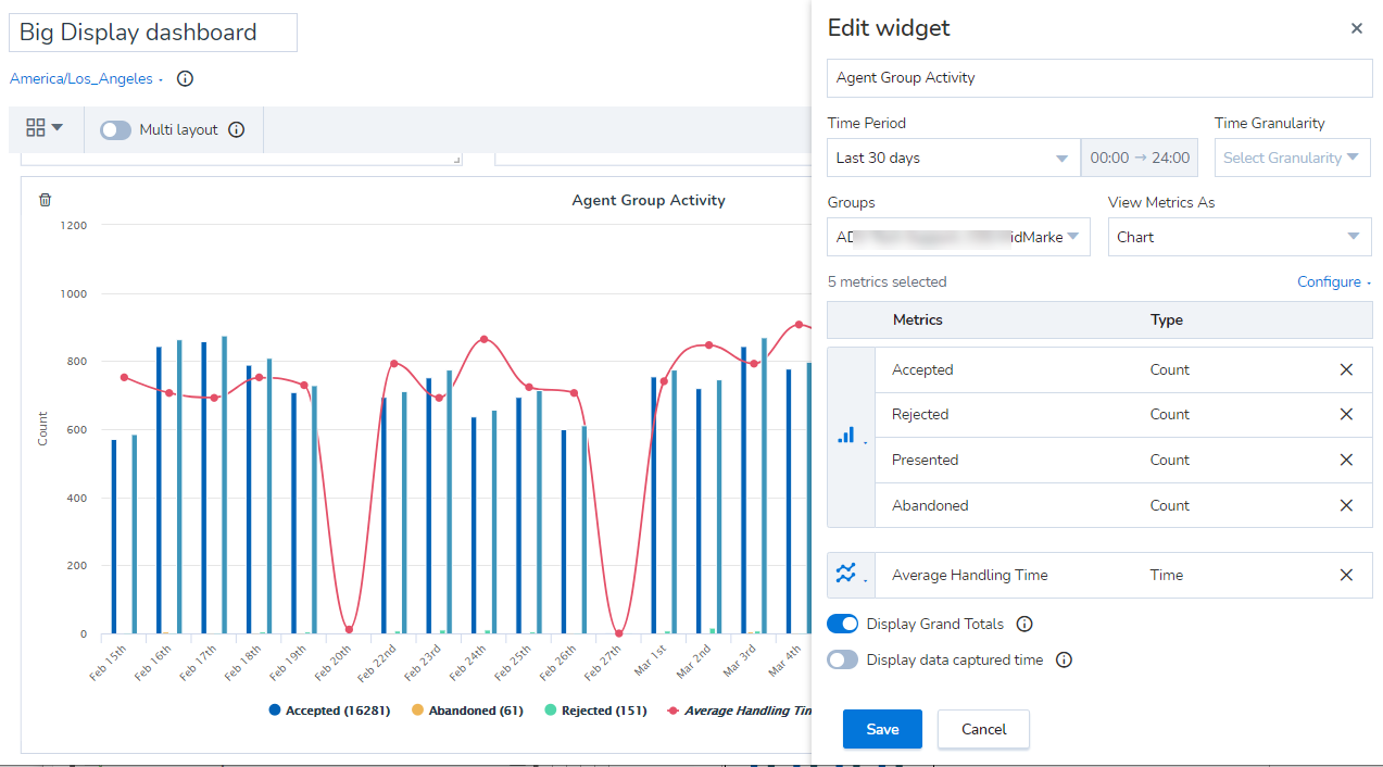

If you wish to see the metrics for each agent group, simply select the data type to Table to view the numbers.
Let’s say you want to track key metrics such as average waiting time, processing time, and number of interactions by media type such as chat, email, phone, and voicemail. What’s the average waiting time for voicemails? Which media type do we experience the longest waiting time?
- Click and select Media Activity widget from the list of historical widgets in the drop-down list.
- Select to get data from a given Time Period such as past 7 days, yesterday, last 30 days, and more or select a custom date range.
- Select Time Granularity to aggregate data from the available choices. Let's say you choose to get data for Last 30 days, you can set to aggregate the data daily or weekly.
- Select all media by default or specific media types.
-
Under View Metrics As, select to view the data in one of the following formats:
- Chart: Displays data in a graphical format. You can further select the specific graphical format such as bar graph , line graph , dotted line chart , and area chart .
- Table: Displays data in rows and columns in a tabular format.
- Big Number: Displays up to three key metrics in big and bold format. big and bold font. You can also highlight your metrics with a background color. Learn more.
- Heat Map: Displays data as a heat map. A heat map uses a system of color coding to represent values. It is useful when you have large data and you need to detect the outliers quickly. Learn more.
- Chart: Displays data in a graphical format. You can further select the specific graphical format such as bar graph
- Select the metrics you wish. (Entered, Accepted, Abandoned, Longest waiting time)
- Click Save to view the data in the selected format.
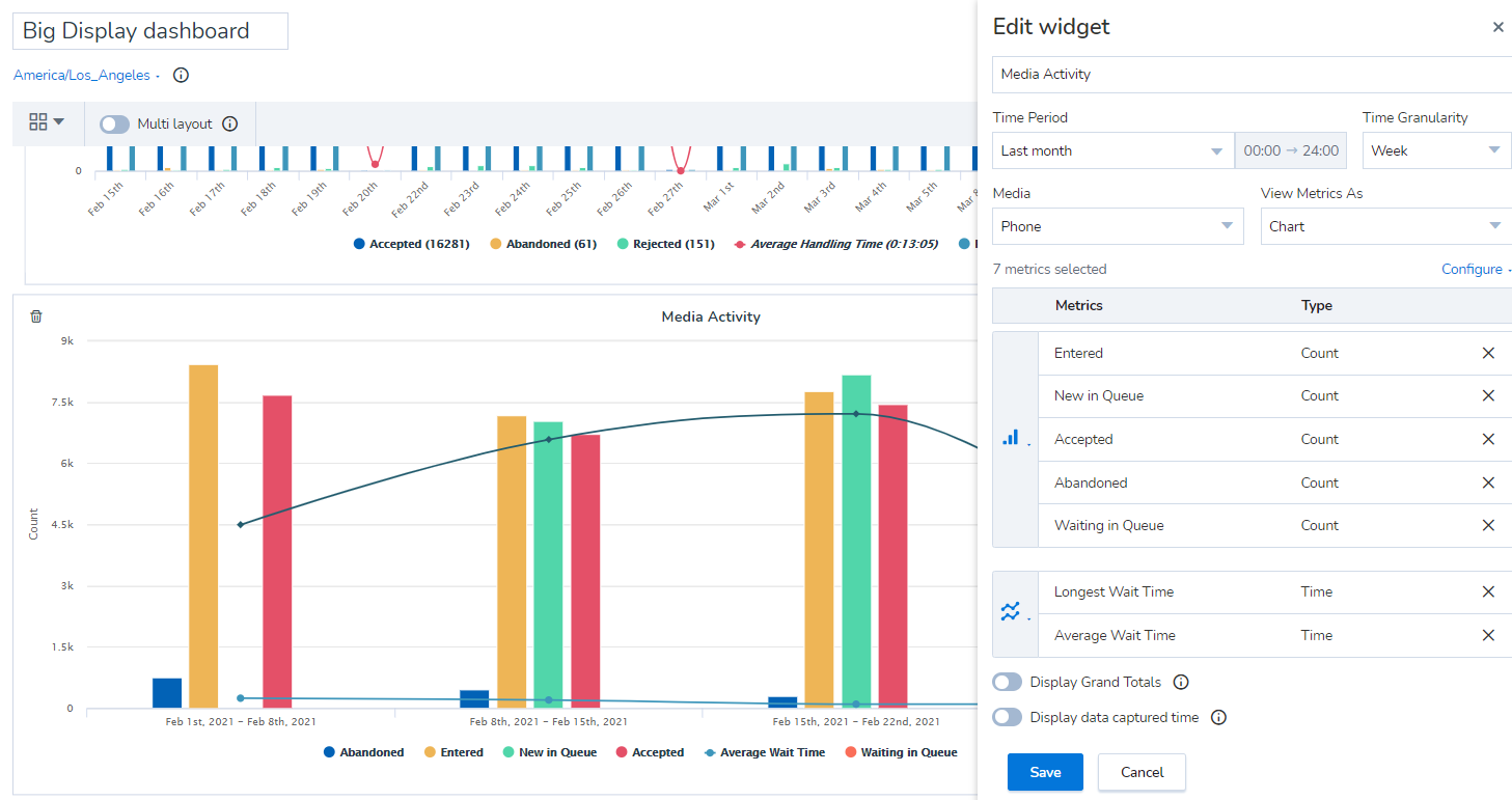
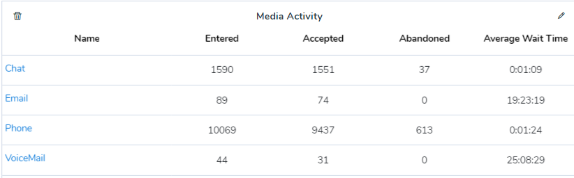
In this example, see how the average waiting time for voicemails is higher than phone, chat, and email media. When you switch to tabular format, you can see metric values for each media type.
Add advanced filters in historical widgets
Let’s say you want to compare the time spent processing chat interactions vs. voice interactions by an agent or a group. You can use advanced filtering within historical widgets for Agent Activity, Agent Group Activity, and Media Activity. Filtering by queues, media, and agents allows you to display more granular data within these widgets.
To add advanced filters in historical widgets:
- From the menu, go to Dashboards.
- Select to edit an existing dashboard.
- Click
 to add a historical widget.
 - As an example, let’s compare key metrics between two agent groups. From the drop-down options, select Agent Group Activity historical widget.
- In the widget window that opens, notice the advanced filtering options available: Groups, Agents, Media, and Queues.
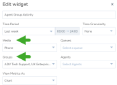
- Select two agent groups from the list. Select Phone from the Media options.
- Add other relevant filters as necessary and click Save.
The widget dashboard displays the metrics allowing you to view and compare the number of accepted, abandoned, and rejected interactions for the two selected agent groups visually.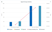


New data range for historical widgets
New date ranges for historical widgets offer more options for custom and pre-determined dated ranges. You can set up any date range for all historical widgets and the historical reports.
Gather aggregated data for intra-day time intervals
Let’s say you want to gather data about agent activity during your company’s second shift from 8 am to 4 pm, you can now select the intra-day time interval and gather data for that time period.
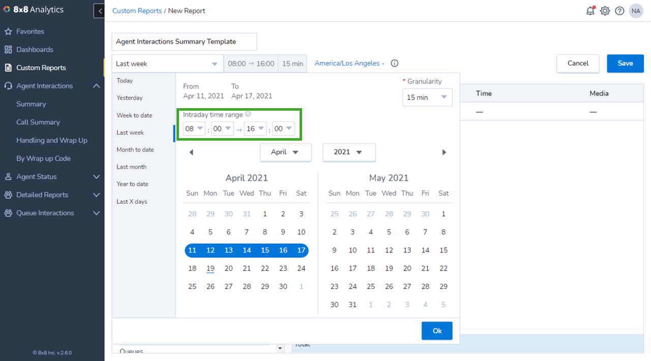
Note: This includes all interactions which:
- Initiated and ended during the selected time interval.
- Started in the previous time interval but ended in this interval.
Display historical key metrics in bold
Display upto three key performance indicators per historical widget on your dashboard in a big and bold font. You can also highlight your metrics with a background color. Select any historical widget and choose to view historical metrics as big numbers.

Display graphical charts for historical widgets
We have added two new forms of graphical charts to represent data. The dotted line chart and the area chart offer you new ways to represent data for historical widgets.
To select the new graphical charts:
- In the Dashboard, select to add a new historical widget.
- By default, the data visualization is set to the chart format.
- Next to the metrics, click
 to select the chart type.
 -
Click Save to launch the chart.
-
Additionally, you can view the grand totals of the key metrics on the legend. While editing a widget, simply enable the option to Display Grand Totals.
Access historical widget data as heat maps
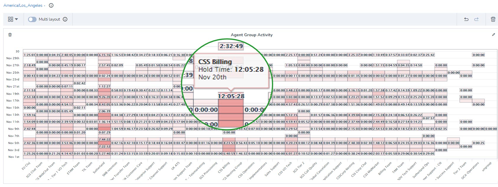
You can view data in historical widgets as heat maps. A heat map uses a system of color coding to represent values. It is useful when you have large data and you need to detect the outliers quickly. Let’s say you want to track the hold time of your agent groups and understand the groups with higher than usual hold time, simply select the Agent Group activity widget, select the desired agent groups, and choose to view metrics as a heat map. Upon saving the widget, the data is shown as a heat map with outliers in a deeper warm tone of red. Simply hover over the cell to access the agent group name, the date, and their hold time. The darker the shade, the higher the value of the metric.
Notes:
- The heat map chart can only be set up for a single metric.
- If the cell is empty, it means that there isn’t any activity on that metric. If the cell shows zero it means that the activity that did happen did not affect the metric on the chart.
- The maximum supported volume of data is 1000 entries. If your report contains more data, you will see an informative message.