Speech Trending Report
The primary purpose of this report is to determine how many calls (or calls with evaluations) have at least one match to a particular topic, and how it trends in time (weeks, months, quarters, years) as organized by the report’s layout grouping, rows, and columns. The report takes the form of a pivot table, similarly to the Speech Report, and contains the following high-level features and sub-features.
Speech Data
Two types of data display conditions are key to this report:
- Time data for the trending ability is always located in columns. The time data values available are Weeks, Months, Quarters, and Years.
- Topics should always be selected in rows. The Topic options available are Topics, Agent Topics, and Caller Topics.
The report layout can be determined by using the “Group By” selector. The options available in the “Group By” selector are Agent, Evaluator, Group, Labels, Supervisor, and Trainer. Note that the user can also choose not to group by any of these options.
Note: If an evaluator is not included, the row offers overall metrics. If an evaluator is included, however, results given are specific only to interactions that contain evaluations.
Average data which is relevant to any of the records can optionally be shown in the additional columns. Users are provided with the ability to filter calls based on whether they were evaluated or not, which allows users to produce all results or a narrower set of results. Customers can create flexible reporting to discover trends and make meaningful business decisions.
Note: This is not an “improved version” of the Average Score report. The metrics of the Speech Trending report are entirely calculated by the Topics, Overtalk, and Clarity that are recorded when speech is processed.
Report Summary
The Speech Trending report also contains a Report Summary, which can be used for quick insight into Topics and how they are trending.
The Report Summary is a visual representation of the report, and can be customized with top/bottom topics matched. The user can switch between the summary view and the table view by clicking the icons at the top of the page, above the report title.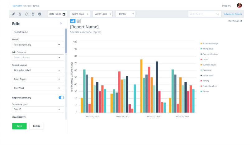
The Report Summary can be removed by the user by simply disabling the Report Summary toggle. When the Report Summary is enabled and the page is refreshed, the Report Summary is displayed in the view by default.
Report Summary Use Case
Users want to have a quick and efficient view of the Topics that have been matched the most and/or least. The Report Summary offers the customer rich visual content to summarize complex reports.
Speech Trending Core Reporting
Users can refresh the report to pull new or changed data based on their selections. The report allows for printing of the current screen view. Date picker controls allow the user to customize the date range or use predefined date ranges. Access to any filtering details is available as well. Any information can be highlighted by using basic search, and advanced search is also available for a more comprehensive search experience.
Core Reporting Use Cases
Each user has the ability to save custom reports. In addition, a user can:
- Print the report as formatted by the browser.
- Run reports on different date ranges.
- Filter, search, and highlight any data.
Speech Trending Metrics
Users now have the ability to report on two different metrics for trending results. They can see the percentage of calls that were matched to a Topic, or not matched.
Metrics Use Cases
- A user wants to find all calls that did not match to Topics within a period of time for compliance verification reasons, and they want to drill down to those calls and manually validate them.
- A user wants to find calls that matched to particular Topics, and analyze how the calls trended over time.
Report Groupings
Users now have the ability to create reports on speech data fields and view trends on matches within a certain time range. Topics should always be a selected data field. The fields available are Topics, Agent Topics, and Caller Topics. Trends can be analyzed based on Weeks, Months, Quarters, or Years.
Grouping Use Cases
- A user wants to determine the Topic-matching percentage of calls taken by agents belonging to different groups, and wants to see how it trends in time across weeks, months, quarters, or years. They can use this information to compare the performance of different group members.
- A user wants to pinpoint campaigns and analyze ways to improve them, so they label calls that have desirable outcome for those campaigns. To do this, they create a report on labels and Topics, and analyze its trends over time (across weeks, months, quarters, or years). This allows you to analyze unusual matches, such as whether any calls labeled with “Satisfied Caller” match a Topic such as “Caller Cancel Request”, or whether this label is only associated with Topics such as “Caller Positive Experience”.
Note: The examples used have references towards the out-of-the-box Categories and Topics, which every customer that purchases Speech has access to in their environment.
Single-Topic Slide-Out
The single-topic slide-out occurs when one of the individual cells are clicked to reveal the slide-out. This action displays matches for a specific Topic within the selected time frame in the column (for example, Week 35).
Because the result always shows as “Matched” or “Not matched”, the view is quite simple. The following elements display in the slide-out:
- A user can switch between a bar chart view and donut chart.
- A user can see the “Row” value at the top, and the “Column” value below it.
- A user can double-click one side of the chart in order to drill down to a search window; this produces a second browser tab.
Slide-Out Use Cases
When customers need to find the root causes of a number of issues, the slide-out allows for deeper data analysis to identify and solve the root of a problem. Some examples of this are:
- A user wants to see why a particular agent’s use of a specific matched topic varies over time.
- A user wants to expose all results from the slide-out in a search window, so that they can review and evaluate calls that have an unusual number of matches or non-matches.
- A user wants to determine where in a call a particular topic is mentioned. Since the relevant report does not go to the interaction level, and the overall values sets are too large, the user is able to quickly filter to find what they are looking for.
Single Topic Slide-Out with Subtotals
The overall subtotal slide-out opens when the overall subtotal cell is clicked for a certain topic. This action displays matches for a specific Topic for each particular time period filtered (for example, a filtered timeframe of 60 days, divided into weeks).
Because the result always shows as “Matched” or “Not matched”, the view is quite simple. The following elements display in the slide-out:
- A user can switch between a bar chart view and donut chart.
- A user can see the “Row” value at the top, and the “Column” value below it.
- A user can click one side of the chart in order to drill down to a particular time period, such as a specific week; this produces a second browser tab.
- A user can see all matched Topics for the group, by item, in the corresponding timeframe (for example, Week 35).
- A user can click one side of the chart, corresponding to a Topic, to see how many calls matched or didn’t match.
Slide-Out Total Use Cases
Users must be able to sort and filter by different dimensions. Using the multidimensional slide-out, the user can see data sliced individually. Some examples of this are:
- A user wants to look at specific Topics matched in calls belonging to one user, and view relevant trends over time.
- A user wants to be able to see all applicable labels for a specific Topic, and view relevant trends over time.
- A user wants to see how supervisors compare to a specific Topic, and proceeds to drill down to data outliers for deeper analysis.