A contact center manager wants to understand and compare performance of a select set of queues based on a standard set of KPIs, with a focus on comparable volume, service level, and good and bad KPI trends.
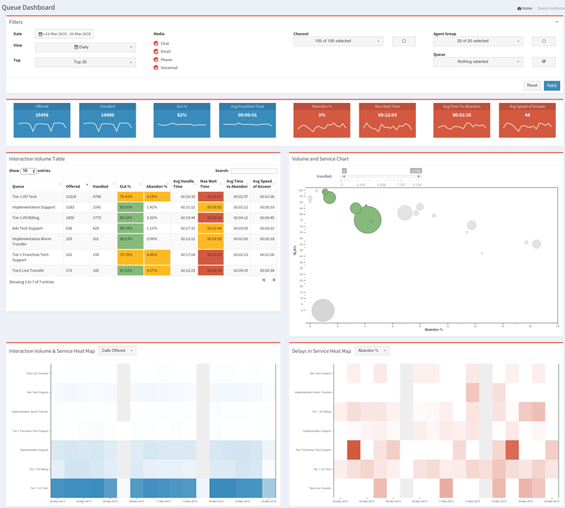
This dashboard clarifies the customer demand and experience in the queues with an extra focus on traffic volume, SLA %, and queue abandonment. The Queue Dashboard provides an activity summary of each queue during a specified time range. It includes the number of calls that entered queues, calls answered, SLA %, average handled time, maximum waiting time, and more.
A contact center manager wants to understand and compare performance of a select set of queues based on a standard set of KPIs, with a focus on comparable volume, service level, and good and bad KPI trends.
The Sparkline charts offer easy-to-see measures for the top seven KPIs measuring queue group/queue performance.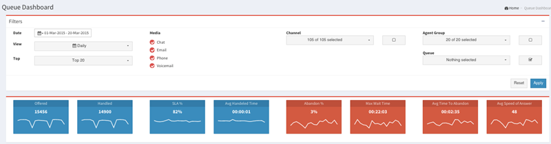
Metrics in blue are in a good range, while metrics in red can indicate a problem. Green is above 80%, and yellow is between 60% and 80%.
This chart visually represents the call volume against the service level. Service level ensures timely attendance of interactions in the queue. The higher the SLA, the better the queue performance, and vice versa. Each bubble represents a queue in the chart, and the size of the bubble represents the volume of calls that entered the queue.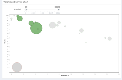
Using the chart, you can compare the performance of various queues based on interaction volume, SLA %, and Abandon %. Bubbles in the lower-right corner indicate the worst service level and highest abandon percentage. The goal is to service queues with a low abandon rate and high service level.
Hovering over a bubble shows metrics for the specific queue-bubbles.
This table breaks down metrics on queue volume and performance for each queue.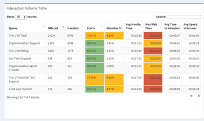
The following metrics are available for each queue:
The Queue Dashboard offers two heat maps that allow a contact center manager to compare the same set of queues using differing sets of metrics (desirable and undesirable), and how the queues trended over time.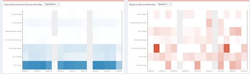
Rob is a contact center manager who learns that new Sales prospects are abandoning calls too quickly. He must verify this information and confirm whether this is true. The manager selects the drop-down filter menu, chooses the desired time range, and selects the Sales Queue Group and the Web Queue Group to compare.
He looks down at the Call Volume Table, sorts by Offered, and looks at the SLA % and the Abandon %. He sees that Prospects Queue has an alert for Max Wait Time, and that the Abandon % shows as red as well. This indicates trouble.
He looks to the Volume and Service Bubble Chart to compare the queues within the Sales and Queue Groups in terms of interaction volume, SLA %, and Abandon %. He is specially focused on which Queues/Bubbles are close to the upper-left (great, but perhaps has too much support) and those close to the lower-right (struggling, and needs more help). He circles the bubbles on the charts he cares about, which filters the rest of the dashboard.
The manager then looks at the Heat Maps for desirable trends (Handled, AHT, volume, SLA %) and undesirable trends (Abandon %, Avg time to Abandon, Max Wait Time). He sees that over the past few weeks, the Web Queues have great SLA % and low volumes, and low abandon %. However, the Premium Queues seem to have opposite trends of more volume, less service, and higher abandon %.
Based on a specific date he sees in the Heat Map, Rob goes back to the Bubble Chart and uses a time slider to look at the specific date. The rest of the dashboard readjusts. He hovers and gets specific information (volume, SLA %, and Abandon %) for the queue bubbles he wants to examine.
|
Follow us on
|
Contact us
|